Warm White or Cool White? Reading a Paint Sample in the Room
Warm white or cool white paint can shift beside floors and daylight. Use a simple room checklist to compare undertones and choose a white that fits.
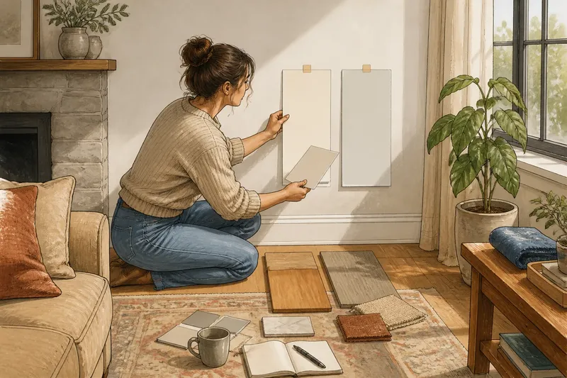
The common mistake with warm white or cool white paint is choosing from a chip under store lighting, then expecting the room to look the same at home. A shade that seemed crisp beside the paint counter may turn creamy against a cool gray floor, leaving the room’s finishes looking unexpectedly mismatched.
Start with what will stay: flooring, trim, counters, upholstery, and the room’s daylight. Check a few samples beside those colors at different times, then use the observations to make a clear decision.
Warm and cool whites differ by undertone, not brightness
White paint is rarely neutral in every setting. A warm white tends toward yellow, cream, peach, or red; a cool white can lean blue, green, or violet. The shift may be subtle on a small card and much more apparent across a wall.
Brightness is separate. A warm white can look bright, and a cool white can look soft. Treat words such as “clean” and “bright” on a paint label as clues, not reliable undertone descriptions. Compare samples rather than choosing by name alone.
Hold a sample beside plain white paper or a familiar ceramic plate. Neither is a perfect neutral reference, since paper and glaze can carry their own cast. Notice whether the paint looks creamier, bluer, greener, or pinker by comparison.
Let the room’s lasting colors guide the choice
Honey-toned wood, beige stone, cream upholstery, and warm rugs often pair comfortably with warm whites. A blue-white beside them may make the wood look more orange or the fabric more yellow by contrast. Pale oak, however, may sit well with a restrained neutral white, so one wooden object need not dictate the whole wall color.
Cool whites often suit blue-gray stone, charcoal details, crisp blue textiles, or trim that is already a clear cool white. They can echo those notes without adding a cream cast. In a room dominated by warm finishes, though, a cool white may intensify their color; choose that contrast deliberately.
When a room holds both warm and cool materials, compare a quieter, less strongly tinted white against each. Give more weight to the largest or hardest-to-change finish, such as the floor or countertop, and use smaller accents to connect the rest.
Check samples in the room’s ordinary light
Direct sun can wash out differences, while shaded areas may reveal a blue, green, or creamy bias. A sample near a window may look unlike the same color on a wall across the room. Put samples on more than one wall if the room receives light from different directions.
Look in morning, midday, and evening light, including the lamps you commonly use after dark. Warm bulbs can soften a cool white; cooler bulbs may make a yellow cast more obvious. Nearby objects also matter: a red rug, green plant, or blue curtain can tint the wall close to it. If one patch seems oddly colored, compare a spot farther from the object before blaming the paint.
Use this room checklist to narrow the samples
Choose two or three candidate whites and make each sample large enough to judge from across the room. Keep them separate, label their names on the back, and compare each with the same fixed finishes. For every item below, record what you see and follow the matching decision.
- Floor: Check whether the sample makes the floor look more orange or gray. If it exaggerates a cast you dislike, set that white aside; otherwise, keep it in the running.
- Counter, tile, or fireplace surround: Check whether the sample makes the fixed surface look harmonious or sharply contrasted. If the contrast feels distracting, try a quieter undertone; if it feels intentional, retain the sample.
- Trim: Check whether the trim looks unexpectedly blue, yellow, or pink beside the wall sample. If the difference bothers you, compare a closer match or a deliberately distinct pairing; otherwise, keep the combination.
- Large upholstery or rug: Check whether the sample makes a dominant fabric look more yellow, orange, or gray. If that shift is unwelcome, remove the sample from consideration; if the materials feel connected, keep it.
- Daylight on more than one wall: Check whether the undertone changes noticeably between a bright wall and a shaded one. If one area becomes uncomfortable, compare a more restrained white; if both remain pleasant, keep the candidate.
- Evening lamps: Check the sample under the lights you normally use. If it turns too creamy or stark for the room’s evening use, try another undertone; if it still feels comfortable, leave it on the shortlist.
- Nearby colorful objects: Check whether a plant, curtain, or rug seems to tint only the area beside it. If the cast fades farther away, judge the paint from the broader wall; if it persists across the wall, compare another sample.
Say your living room has maple floors, a tan sofa, and a rug with muted rust threads. Imagine you label two sample boards, one warm white and one restrained neutral, and place both beside the floor and sofa. In morning light, the warm sample ties the floor to the sofa but makes the rust look too orange; the neutral sample leaves the rug calmer, so you keep the neutral on both walls for an evening check. If it stays comfortable under the lamps, it becomes the stronger option; if it turns stark, the tradeoff points toward a quieter warm white instead.
How do you settle common white-paint questions?
What if the room has warm wood and cool gray stone?
Compare a restrained white beside both materials, then give more weight to whichever finish dominates the room or is harder to change. If neither candidate feels balanced, use textiles or smaller accents to connect the two tones.
Should the walls and trim be the same white?
Matching can create a quiet, continuous look, but the same paint may appear different on trim and walls because of the surfaces and their light. If the trim is staying, compare the wall sample directly beside it before choosing.
What should you do if a sample shifts from morning to evening?
Judge it across the room’s usual lighting rather than by its best moment. If it becomes uncomfortable during the hours you use the room most, compare another undertone instead of relying on a favorable time of day.
Does “pure white” mean the paint has no undertone?
No. “Pure” is a product description, not a promise that the color will look neutral beside your finishes. Check the sample in your room and follow the paint maker’s directions for applying it.
Spend effort on comparisons that can change the decision
It is not worth collecting a stack of nearly identical chips or judging subtle differences through a phone camera. Screens adjust color, and too many similar options can make the samples harder to distinguish. A few labeled samples beside lasting finishes and in ordinary light provide a clearer basis for choosing warm white or cool white paint.
Think of the choice as a relationship between undertone, materials, and light, not a contest for the “truest” white. Before settling on a shade, revisit the leading sample under the lighting you use most; that last check can reveal whether it belongs with the room beyond the paint counter.